
Checkout styling
Style your checkout to match Klarna's branding by integrating approved assets, configuring descriptors, and applying dynamic messaging for a consistent and localized payment experience.
8 min read
This guideline outlines the available methods for styling Klarna elements within your checkout. A well-styled checkout creates a cohesive brand experience, builds customer trust, and improves conversion rates. By integrating Klarna's design elements consistently, you ensure customers recognize and feel confident using Klarna as a payment method.
You can retrieve and apply Klarna branding assets, configure payment method descriptors, and integrate dynamic messaging using Klarna's APIs. These styling options ensure your payment interface remains consistent, localized, and compliant with Klarna's design specifications.
Before styling your checkout:
- Implement Payment Presentation in your checkout flow
- Set up the Klarna Payment SDK
- Verify your integration environment is configured correctly
Klarna provides a set of logo variations that display Klarna within your payment form. When you mount the checkout, Payment Presentation dynamically retrieves these logos, ensuring the branding remains up to date and compliant with Klarna's visual guidelines.
Select the logo shape that best fits your checkout layout and design:
- Badge: Recommended for optimal clarity and brand recognition - effectively communicates the Klarna payment method
- Rectangle: Useful for horizontal payment method displays
- Square: Ideal for grid layouts or icon-based payment selectors
Badge logo recommended
Klarna recommends using the badge for optimal clarity and brand recognition, as it more effectively communicates the option to pay with Klarna.
To retrieve the badge, set the
shape attribute of the icon component to badge.
JAVASCRIPT
1
2
3
4
5
6
7
8
9
10
try {
const response = await Klarna.Payment.presentation({
amount: 10000,
currency: 'USD',
});
response.icon.component({
shape: 'badge',
}).mount('#icon-container');
} catch (e) {
// Handle error eTo retrieve the rectangle icon, set the
shape attribute of the icon component to rectangle.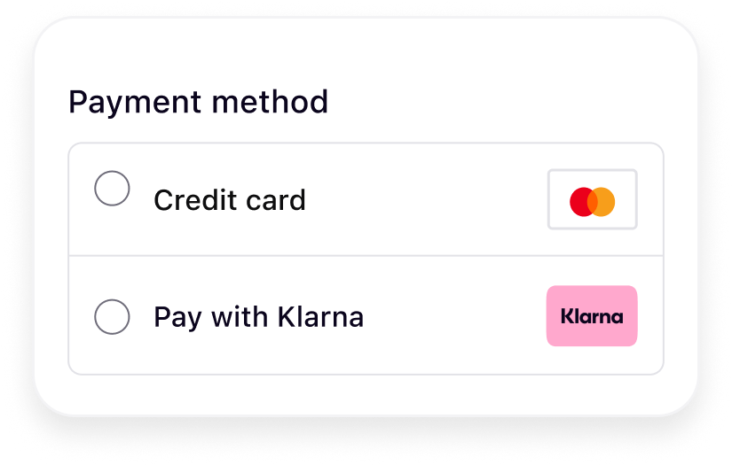
JAVASCRIPT
1
2
3
4
5
6
7
8
9
10
try {
    const response = await Klarna.Payment.presentation({
        amount: 10000,
        currency: 'USD',
    });
    response.icon.component({
        shape: 'rectangle',
    }).mount('#icon-container');
} catch (e) {
// Handle error eTo retrieve the square icon, set the
shape attribute of the icon component to square.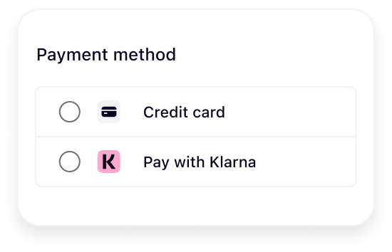
JAVASCRIPT
1
2
3
4
5
6
7
8
9
10
try {
    const response = await Klarna.Payment.presentation({
        amount: 10000,
        currency: 'USD',
    });
    response.icon.component({
        shape: 'square',
    }).mount('#icon-container');
} catch (e) {
// Handle error eAs outlined in the Payment Presentation overview, Klarna provides Acquiring Partners with a set of headers and customer-facing messages via the Payment Presentation. These messages are transparent, concise, and dynamically tailored to the specific customer and purchase context.
Mount each component to display the appropriate messaging:
JAVASCRIPT
1
2
3
4
5
6
7
8
9
10
try {
    const response = await Klarna.Payment.presentation({
        amount: 10000,
        currency: 'USD',
    });
    response.header.component().mount('#header-container');
    response.subheader.component().mount('#subheader-container');
    response.message.component().mount('#message-container');
} catch (e) {
// Handle error eThe components don't include predefined styles. Apply custom styling by targeting individual elements using the selectors available in the rendered output. This provides full flexibility to adapt the presentation to match your checkout's visual design while maintaining the integrity of Klarna's messaging.
CSS
1
2
3
4
5
6
7
8
9
10
[klarna-payment-header] {
    font-size: 16px;
}
[klarna-payment-subheader] {
    font-size: 16px;
}
[klarna-payment-message] {
    font-size: 16px;
}
You can apply your site's font to Klarna elements to preserve brand consistency. However, for optimal legibility and alignment with Klarna's design standards, use a system font or a simple, readable typeface. If you use a custom font, avoid italic styles or any formatting that may reduce readability. Clarity must take precedence over stylistic choices.
Recommended for integration
Ensure sufficient font weight and size for readability across devices. Test your font choices on both desktop and mobile views.
The Payment Presentation payment button is recognizable and helps customers understand what happens next, building confidence to proceed with their purchase. The button appears in the payment form once Klarna is selected.
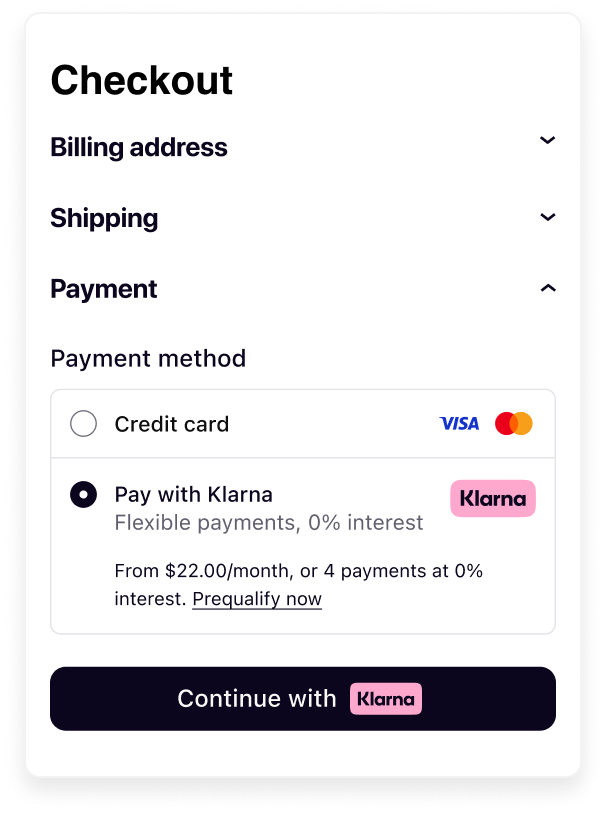
Customize the button's appearance to match your site's design while maintaining Klarna's brand recognition. You can adjust three key aspects: theme, shape, and size.
The theme defines the button's color scheme. Select a theme that provides sufficient contrast with your checkout background.
Available themes:
- Default (dark): Black button for light backgrounds - most recognizable by customers
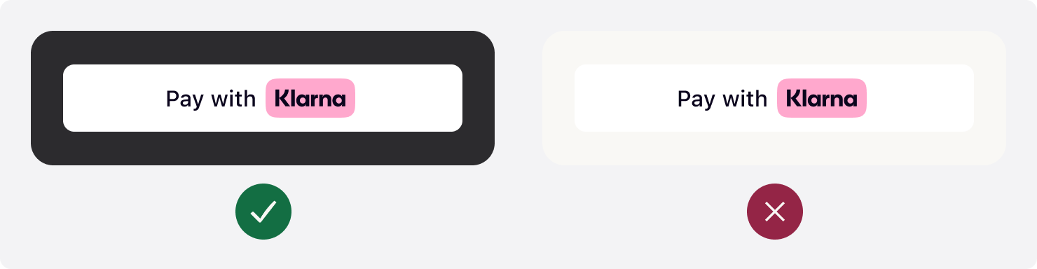
- Light: White button for dark backgrounds
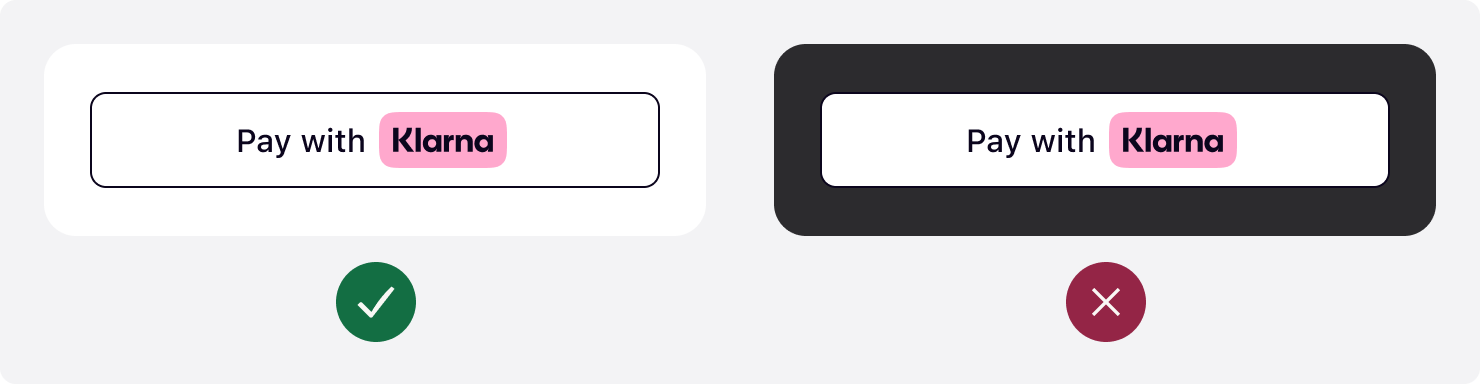
- Outlined: White button with black outline - versatile for various backgrounds
The button's default theme color is dark. Since the
theme attribute is optional, the default theme applies when you set the attribute to default or omit it entirely.Integration requirement
Don't use the default theme on black or dark backgrounds. Ensure sufficient contrast between the button and background for visibility and accessibility.
Klarna recommends using the default theme - it's widely recognized by Klarna customers and looks good on light backgrounds.
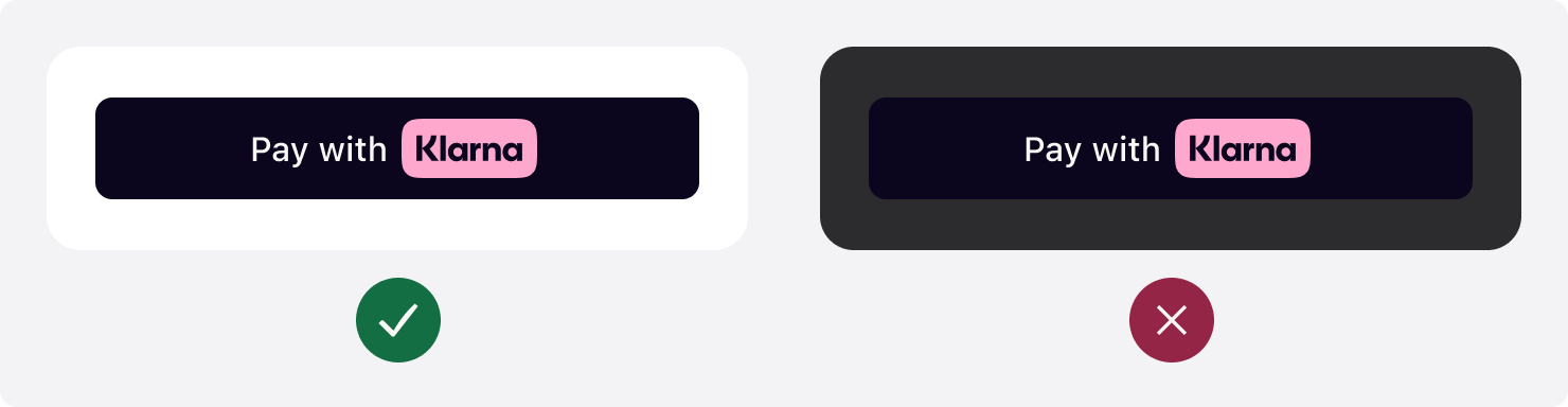
JAVASCRIPT
1
2
3
4
5
Klarna.Payment.button({
    theme: "default", // Used to set the theme of the button
    ...
}).mount('#container')
Use the light theme to make the button visible on dark backgrounds. To apply the light theme, set the
theme attribute to light.Integration requirement
Don't use the light theme on white or light backgrounds. Ensure sufficient contrast between the button and background.
JAVASCRIPT
1
2
3
4
5
Klarna.Payment.button({
    theme: "light", // Used to set the theme of the button to light
    ...
}).mount('#container')
Use the outlined theme to make the button visible on all backgrounds. To apply this theme, set the
theme attribute to outlined.Integration requirement
Don't place the outlined button on dark or saturated backgrounds. Ensure sufficient contrast for the outline to be visible.
JAVASCRIPT
1
2
3
4
5
Klarna.Payment.button({
    theme: "outlined", // Used to set the theme of the button
    ...
}).mount('#container')
Customize the button's shape to match your site's look and feel. This creates a visually cohesive and engaging customer experience. Control the button's shape by changing the value of the
shape attribute.Three shapes are available: default, rectangular, and pill.
The default button shape is a rectangle with rounded corners. To apply the default shape, set the
shape attribute to default.
JAVASCRIPT
1
2
3
4
5
Klarna.Payment.button({
    shape: "default", // Used to define the shape of the button
    ...
}).mount('#container')
To apply the rectangular shape with square corners, set the
shape attribute to rect.
JAVASCRIPT
1
2
3
4
5
Klarna.Payment.button({
    shape: "rect", // Used to style the button with a rectangular shape with square corners
    ...
}).mount('#container')
To apply the pill shape, set the
shape attribute to pill.
JAVASCRIPT
1
2
3
4
5
Klarna.Payment.button({
    shape: "pill", // Used to style the button in a pill shape
    ...
}).mount('#container')
Properly size the Klarna button to ensure visibility and prominence in your checkout flow.
Display the Klarna button prominently. Make the button the same width as other payment buttons in stacked button layouts.
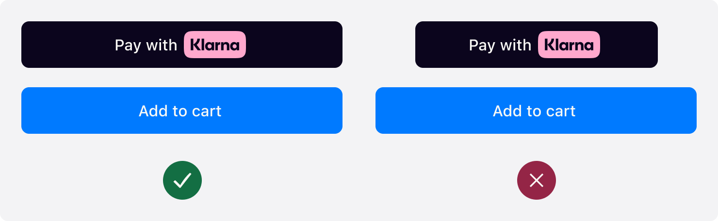
When the button width is below 160px or the copy doesn't fit in the button, the text is removed and only the Klarna wordmark is shown.

The default recommended height of the Klarna button is 48px and the minimum height allowed is 40px. Ensure the button is the same height as other payment buttons.
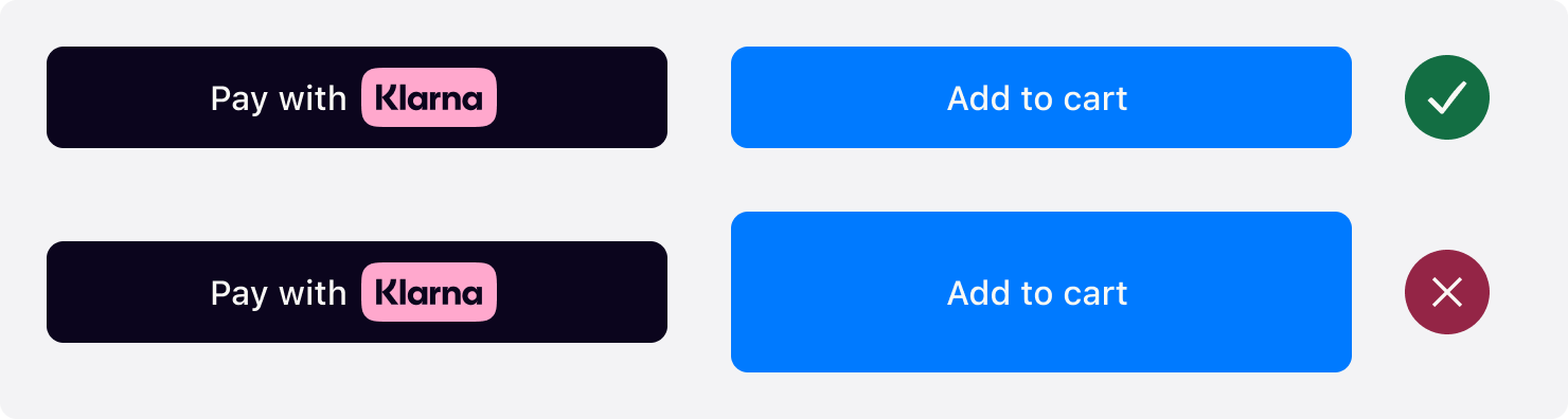
Follow these guidelines to create an effective Klarna checkout experience:
- Consistency: Match the Klarna button's size, shape, and spacing with other payment buttons
- Contrast: Always ensure sufficient contrast between button theme and background
- Visibility: Place the Klarna logo and button prominently in your payment form
- Testing: Test your styling across different devices and screen sizes
- Brand compliance: Use only approved Klarna assets and follow the design guidelines
- Verify the container element exists in the DOM before mounting
- Check browser console for JavaScript errors
- Ensure the Klarna SDK loaded successfully
- Confirm the
amountandcurrencyparameters are valid
- Verify CSS selectors match the rendered elements
- Check for CSS specificity conflicts with your site's stylesheets
- Use browser developer tools to inspect the rendered components
- Ensure CSS rules are loaded after the Klarna components mount
- Verify the
shapeparameter is one of:badge,rectangle, orsquare - Check the container element has sufficient space for the icon
- Confirm the API response includes the icon component
Related articles
Jump to section...