

Checkout styling
Design a checkout experience that aligns with Klarna’s brand and enhances clarity by applying recommended themes, sizes, logos, and layout options for maximum visibility and trust.
5 min read
This guideline outlines the available methods for styling the appearance of Klarna elements within the checkout. It details how to retrieve and apply Klarna branding assets, configure payment method descriptors, and integrate dynamic messaging using Klarna’s APIs. The goal is to ensure the payment interface remains consistent, localized, and compliant with Klarna’s design specifications.
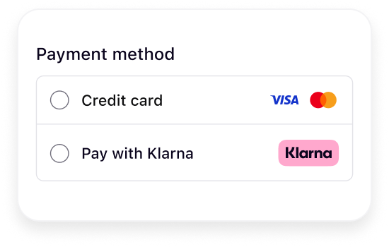
Merchants should dynamically retrieve the Klarna badge from the response of the create_session :
:
:
JSON
1
2
3
4
5
6
7
8
9
"payment_method_categories": [
{
"asset_urls": {
"descriptive": "https://x.klarnacdn.net/payment-method/assets/badges/generic/klarna.svg",
"standard": "https://x.klarnacdn.net/payment-method/assets/badges/generic/klarna.svg"
},
...
],
If the checkout layout requires a different format, Merchants can alternatively download the square or rectangle Klarna logos from the links below and embed them directly in the checkout experience:
https://osm.klarnaservices.com/images/badges/klarna_badge_square.svg
https://osm.klarnaservices.com/images/badges/klarna_badge_rectangle.svg
Merchants should dynamically retrieve the header from the response of the create_session. Depending on the integration setup, the response can return either one descriptor or three descriptors.
. Depending on the integration setup, the response can return either one descriptor or three descriptors.In the response, this appears as
payment_method_categories.identifier. The localized copy for each market (e.g., en-US, es-ES, en-BE) is returned in the same response as payment_method_categories.name:JSON
1
2
3
4
5
6
7
8
9
10
{
  "payment_method_categories": [
    {
      "asset_urls": {},
      "identifier": "klarna",
      "name": "Pay with Klarna"
    }
  ]
}
This configuration is managed by Klarna during implementation. By default, only one header is shown.
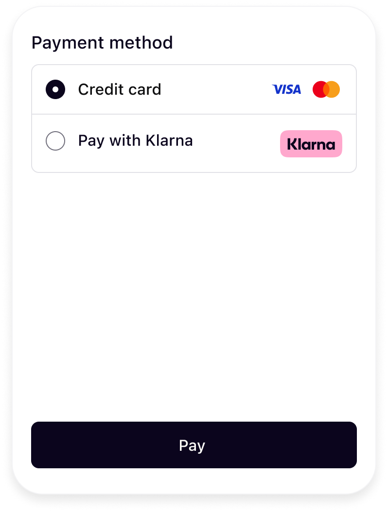 | 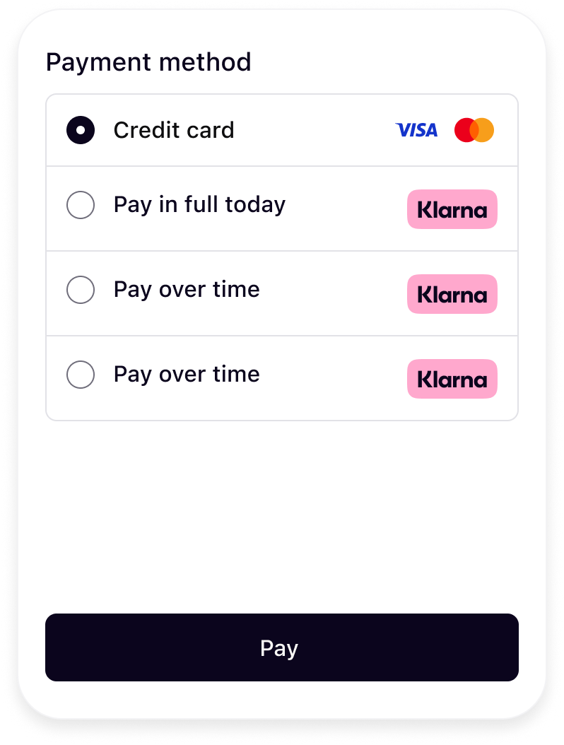 |
| One descriptor | Three descriptors |
When using the
load() call, the widget will be dynamically rendered with the appropriate message.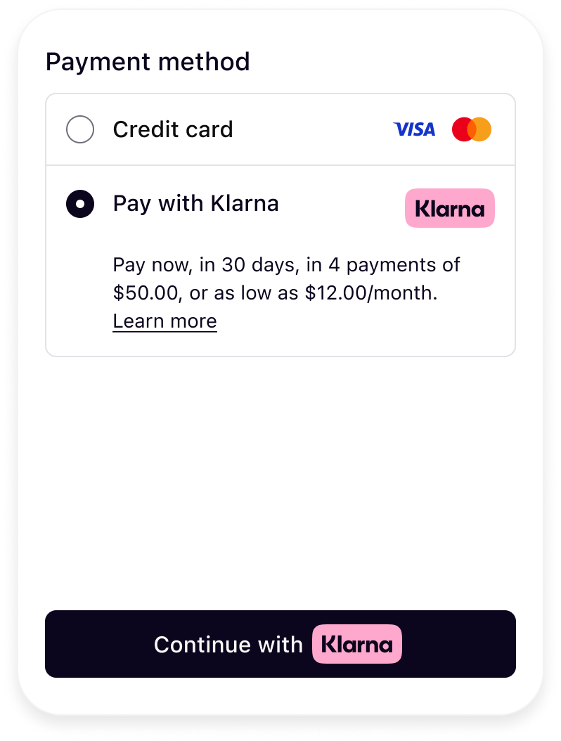 | 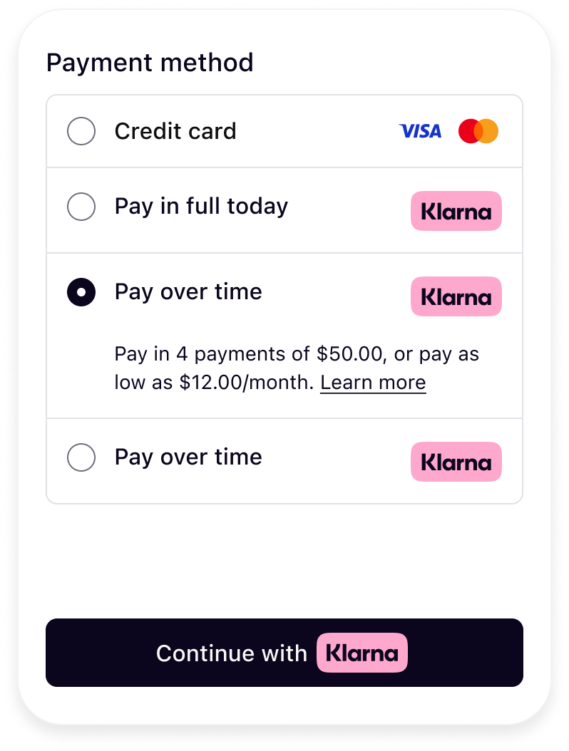 |
| One descriptors | Three descriptors |
If you are unable to retrieve descriptors dynamically, please refer to Klarna’s approved descriptor guidelines and add them manually to your checkout.
You can apply your site’s font to Klarna elements to preserve brand consistency. However, for optimal legibility and alignment with Klarna’s design standards, a system font or a simple, readable typeface is recommended. If using a custom font, avoid italic styles or any formatting that may reduce readability, as clarity must take precedence over stylistic choices.
The Klarna payment button is recognizable, ensuring customers understand what happens next and feel confident in proceeding with their purchase. The button should be displayed within the payment form only after Klarna is selected as the payment method.
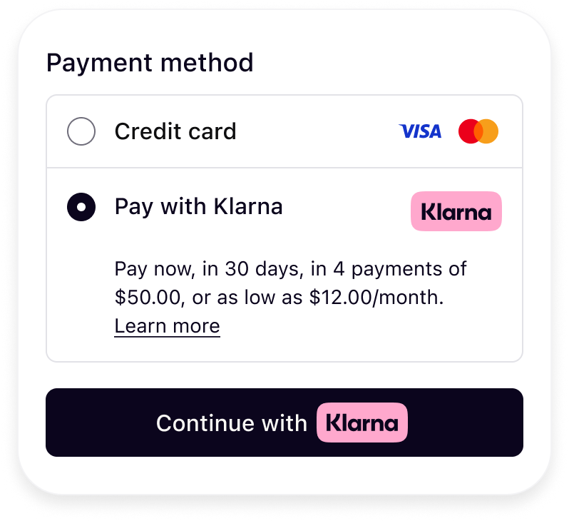
To correctly render the Klarna Payment button, include Klarna’s CSS and configure the button with your preferred theme, shape, and copy.
Sample code
HTML
1
2
3
4
5
6
7
8
9
10
<link rel="stylesheet" href="https://js.klarna.com/web-sdk/buttons/payment-button.css" />
  <button
    style="width: 100%"
    class="klarna-sdk-button theme-outlined shape-rect"
    aria-label="Continue with Klarna"
  >
    <div class="klarna-sdk-button__outline" aria-hidden="true">
</div>
You can adjust the button’s appearance and behavior by customizing the following:
Klarna provides multiple theme options to match your site’s design. Update the button class to switch between themes:
HTML
1
2
class="klarna-sdk-button theme-outlined shape-rect"
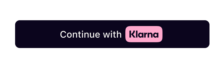 | 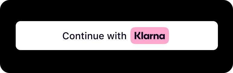 | 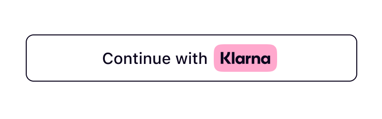 |
theme-dark | theme-light | theme-outlined |
Don’t use dark theme on black or dark backgrounds. The button must be used on backgrounds that provide sufficient contrast.
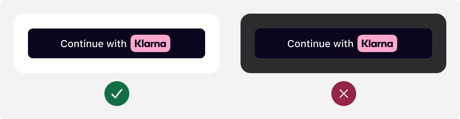
Don’t use light theme on white or light backgrounds. The button must be used on backgrounds that provide sufficient contrast.
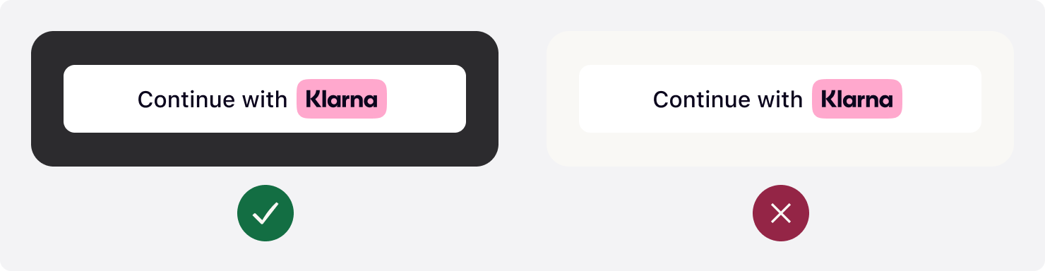
The Klarna button supports multiple shapes. Update the class to choose the appropriate option:
HTML
1
2
class="klarna-sdk-button theme-outlined shape-rect"
 |  |  |
shape-default | shape-pill | shape-rect |
Klarna provides approved translations per market. Always use the correct localized copy for each country. To update button text and accessibility labels:
- Update the
aria-labelfor accessibility. - Update the
klarna-sdk-button-copytext for the visible button label.
HTML
1
2
3
4
<button aria-label="Continue with Klarna">
  <span class="klarna-sdk-button-copy">Continue with</span>
</button>
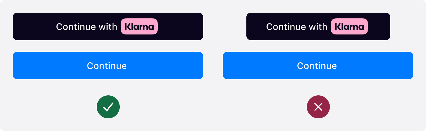
Prominently display the Klarna button. Make the button the same width as other payment buttons in stacked button layouts.
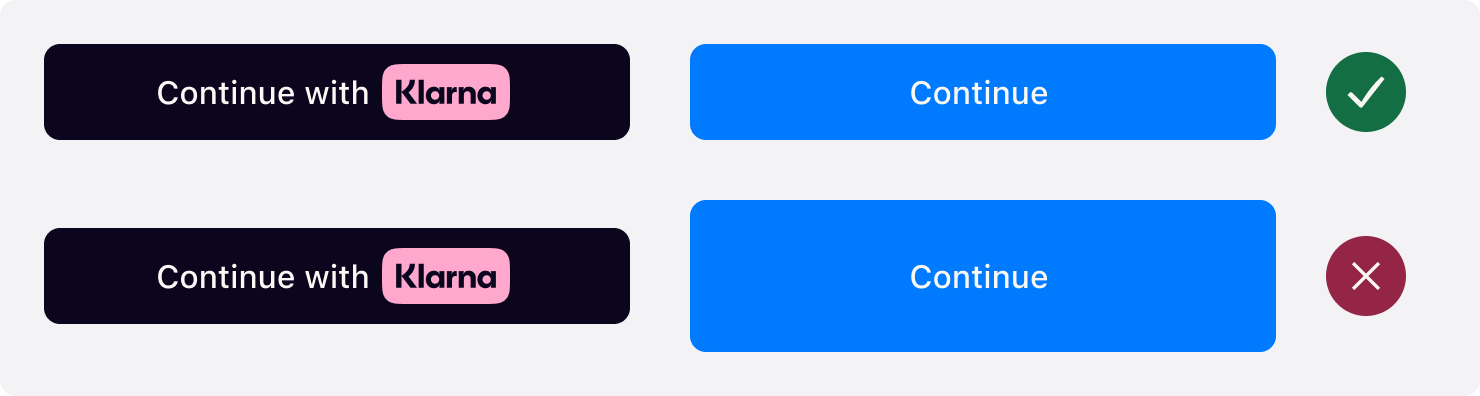
The default recommended height of the Klarna button is 48px and the min height allowed is 40px. Make sure the button is the same height of other payment buttons.
Jump to section...